
Some living room paint colors, designers say, are feeling outdated. We explore the living room paint colors going out of style, and what you can use instead
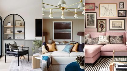
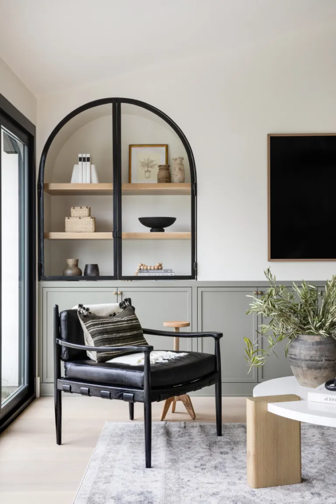
An example of beautiful living room color schemes
(Image credit: Lindye Galloway Studio + Shop/Chad Mellon / Albion Nord / Sascal Studio)
Adding color with paint is a quick and easy way to add style and personality to a living room, but getting it wrong by using living room paint colors that are going out of style, could risk ruining one of the most important spaces in the home.
Much like with any outdated decorating trend, one of the biggest mistakes is to eschew living room paint ideas and color altogether for fear that your space will age badly.
Here, interior designers, decorators, and color psychologists reveal what living room paint colors are going out of style, and how best to avoid outdated paint colors for a perfect living space that truly sings.
Experts Share The 5 Living Room Paint Colors Going Out Of Style For 2024
Color (even if you’re using neutrals) should be the first thing to consider when you are looking for living room ideas, and it’s time to remove gray, white, yellow, cyan and orange from your living room color list.
Whether you’re looking to refresh your space for the new year ahead, or are moving into a new home and are in need of expert advice on the latest paint trends, we explore the five living room paint colors going out of style – and expert advice on which shades are replacing them.
1. CHOOSE BEIGE IN FAVOR OF DARK GRAY
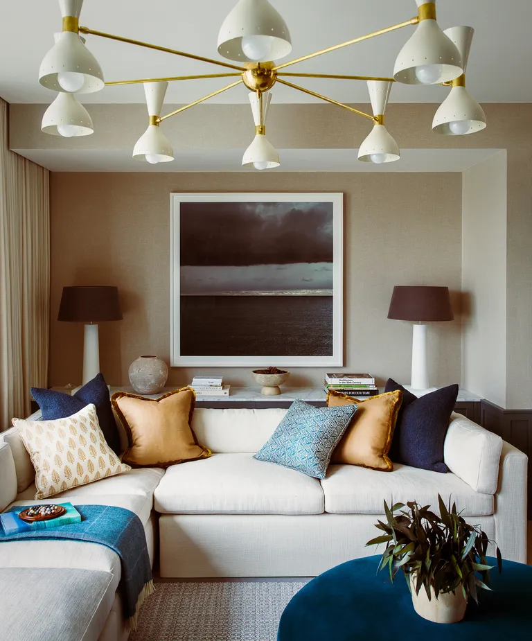
Where once decorating with gray, was the versatile neutral of choice for designers and homeowners alike, it has since fallen out of fashion. That is not to say we’ve done away with neutral color schemes for good. Warming, beige rooms are the new gray in interior design, and it isn’t too difficult to see why. The beauty of a neutral scheme is that it provides a wonderful scaffold upon which to hang accents of color.
Subtle nuances of color are why James Thurstan Waterworth, founder of Thurstan, favors neutral colors, like beige, ivory and sand, in his living room schemes because they create a soft springboard from which antiques, art and other embellishments are able to sing.
‘You can then build out from here with tactile surfaces, patterned textiles, eclectic furnishings and more modern flourishes to create layers of interest, while still allowing all the individual elements of the interior to breathe. I gravitate towards natural palettes, and materials too, as for me they bring a certain timelessness and longevity to design.’ In fact, beige, and its many variations, is also one of the colors replacing white, too.
2. SWAP PURE WHITE FOR TAUPE AND SEPIA TONES
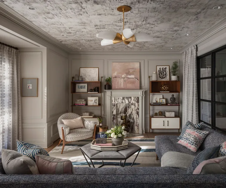
Decorating with white will always play a pivotal role in interior design, but it is fair to say that we have grown tired of this no-decision color, and, similarly to gray, it is one of the cooler living room paint colors going out of style for 2024.
White, when used as a standalone paint color, can be too harsh, cold, and clinical. The living room is usually the space that we retire to at the end of the day, so this should be a room that aids calm, relaxation, coziness and warmth.
‘When working with neutral room ideas, my only rule is to steer clear of white walls,’ says interior designer, Rachel Chudley. ‘They work well in galleries for the very reason that they create a blank canvas, which is perfect for focusing on one piece of art, uninterrupted by anything. However, in a living space, you need a touch of color to add a bit more depth and reflect the light around the room.’
That is not to say you shouldn’t decorate with white in its entirety. ‘The color pairing I keep returning to is multiple shades of brown and white,’ says Paolo Moschino, co-owner, Nicholas Haslam. ‘It is very important to use layers of the same combination to create contrast, depth and the feel of a well-lived-in space. I admire the American designer Bill Blass, and his brown and white apartment in New York has been my number one inspiration for many years.’
3. SKIP UNFORGIVING YELLOW FOR A DRAMATIC RED
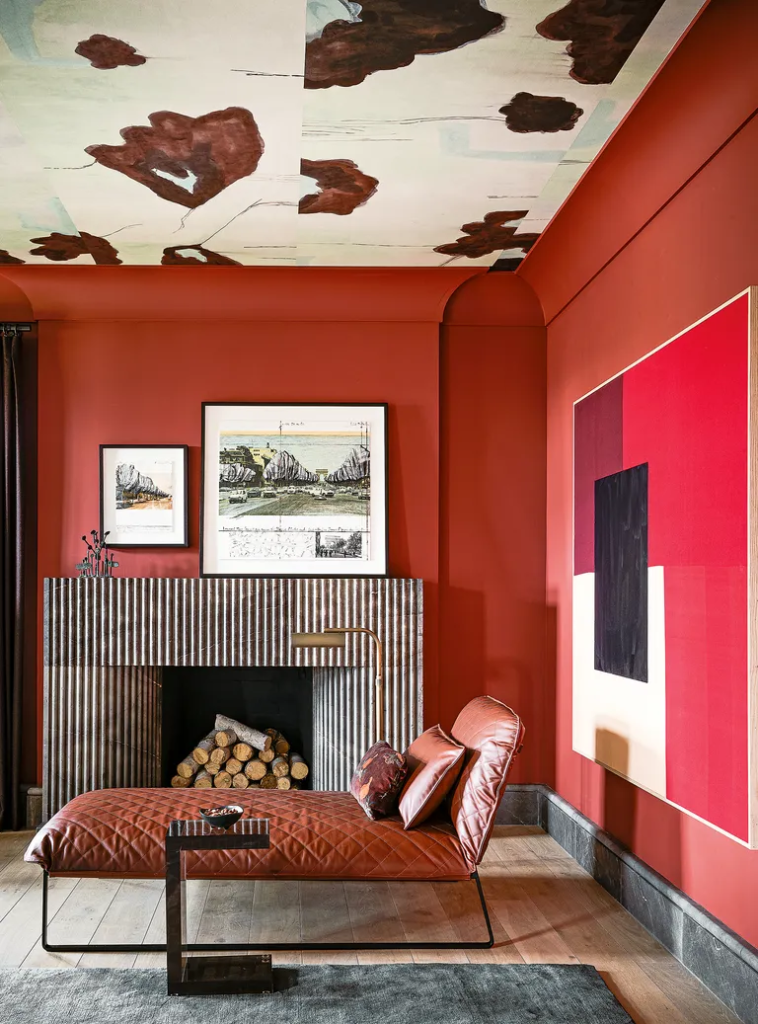
Decorating with red can transform interiors, adding a sophisticated, fun aesthetic to modern living rooms. While red is often considered to be one of the the most stressful colors for some, for others it can provide a burst of optimism, and in the last year, we’ve seen a big rise in the use of rich red shades for warm color schemes, instead of an outdated mellow-yellow.
‘When using red in a living room, it’s best to choose shades that are rich and warm rather than loud and insistent. Maroon, burgundy, and rosehip work brilliantly with shades of green, while deep pinky-reds are very adaptable and blend well with khaki or stone. Dark reds pair best with gold metallic touches and carry a degree of heritage, especially when mixed with dark wood,’ says Simon Temprell, head of interior design at Neptune.
With bold colors, it is time well spent to consider how you react to the color and how it makes you feel. There is often a clue in our closets as to which colors we lean towards. However, while we can change our outfits, we can’t so easily make that change with our interiors. Avoid expensive mistakes by getting two or three sample pots of different shades to compare.
4. DITCH TEAL FOR SAGE GREEN
The attention-grabbing teal, also known as cyan, has been used in our interiors for centuries, but it can sometimes leave us feeling cold – another cooler living room paint color going out of style. Teal appears on the color wheel between blue and green, so its boundaries are blurred, and numerous interpretations of it exist, from light to dark.
If you want to use a nature-inspired hue, more earthy, deeper shades such as sage green are proving popular instead. With their graceful hues, sage greens can be the perfect color for living rooms but work best in spaces with certain orientations. Bluer-tinged tones can feel chilly in north-facing rooms, while south-facing areas make the greener traces appear more yellow.
The color also acts as an effective bridge between the outdoors and inside when used in threshold spaces. When seen in enclosed rooms, the color brings relief and reassurance and elegantly reminds us of the living world beyond our four walls.
Sage has enormous scope as a mindful décor mainstay and is also seen as an effective backdrop for other organic shades. ‘We are noticing a change to the use of softer hues, such as sage, being used all over as a base color, just how neutrals have been used traditionally,’ says Ruth Mottershead, creative director at Little Greene.
‘These are very calming, positive shades with a timeless quality, that are muted but not enough that they fade into the background, so they work beautifully as a foil for similar earthy tones and richer colors such as browns and ochre, which can give a more dynamic effect.’
5. SWITCH OUT ORANGE IN FAVOR OF PEACH AND SALMON PINK
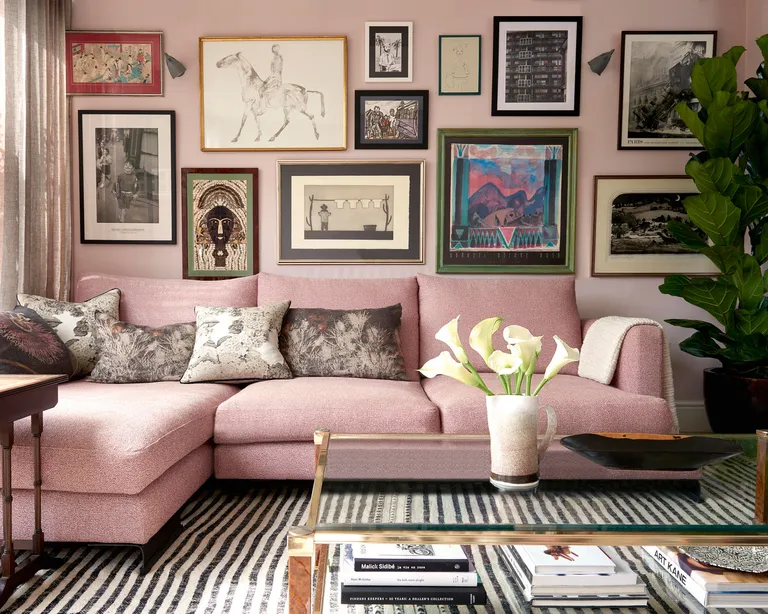
Shades of pink are extremely versatile and pink living room ideas have been a popular choice in interiors for centuries. Of all the variations, salmon pink and peach have the edge over others as they share orange undertones and warm characteristics, making it an ideal choice for those that still love decorating with orange.
‘The salmon is called the king of fish for good reason. In all its forms, salmon is a color we have enjoyed on the walls of our homes, just as much as we have on our plates for centuries. The distinctive blush orange color was first described as salmon pink in the late 1700s, and appeared on the walls of the finest houses until the 1940s, where it became widely available to the masses through affordable modern emulsion paints,’ says Marianne Shillingford, Dulux creative director. Peach, on the other hand, saw great popularity in later decades. ‘Its warm candlelight glow makes living rooms and snugs feel cozy and welcoming,’ adds Marianne.
With its clear ties to the natural world, salmon pink is used for painting living room accent walls and brightening living rooms with splashes of color that symbolize and promote health and vitality.
‘Due to its close relationship with pink and orange shades, the color is mood-boosting and energy-stimulating without becoming overwhelming like many richer, louder orange shades. On the other hand, with more muted and subtle tones, salmon pink can become a good choice to enhance quiet confidence and serenity,’ enthuses Sarah Lloyd, senior brand manager at Valspar.
‘Peach also has a clear connection with nature and represents a set of shades ranging from a light orange pink to a yellow-hued orange,’ Sarah expands. ‘It is often used as a neutral shade instead of beige and warm whites. Encouraging light into a space, enriching it with calming yet refreshing energy, peach pink is great for a living space.’
When choosing the right paint color for your living room, we always recommend applying testers of paint onto sheets of white paper, then tacking them onto each wall you’re thinking of using that color on. Leave them up for a few days before making any final decisions, noticing how the light affects the color at different times of day, as well as checking they work well next to other elements, such as curtains or couches.
If you’re not confident in choosing room color ideas, go with a pre-selected paint palette already picked out by the paint brand you’re using.
Jennifer Ebert