
Use these living room paint ideas to create striking visual effects using the latest colors and trends
Adding color with paint is a quick and easy way to add style and personality to a living room. Whether your living room is an oasis of calm or home to a house full of children, nothing can transform a space like paint. Take a look at these brilliant living room paint ideas to inspire your own decorating scheme.
Color (even if you’re using neutrals) should be the first thing to consider when you are looking for living room ideas. Ensure your chosen hues work well in your room by applying testers of paint onto sheets of white paper, then tacking them onto each wall you’re thinking of using that color on.
Leave them up for a few days before making any final decisions, noticing how the light affects the color at different times of day, as well as checking they work well next to other elements, such as curtains or couches.
If you’re not confident in choosing a scheme, go with a pre-selected palette already picked out by the paint brand you’re using, or follow our advice later on working with tonal, harmonizing and contrasting colors.
LIVING ROOM PAINT IDEAS
These paint ideas have been chosen for their suitability for living rooms but also because they are on trend for the year ahead – yet ultimately timeless. Choose a tone that’s right for the orientation of your room – east- and north-facing living rooms will need warmer shades than south- or west-facing living rooms.
Similarly, poorly lit rooms will benefit from lighter shades – unless, of course, you purposely choose to make your living room dark and cozy.
1. CREATE AN OMBRÉ EFFECT
One of the main entertaining spaces in the home, the living room is the perfect place to create a stunning feature paint effect to capture attention.
There is an array of living room feature wall ideas to choose from, but using paint can be a simple yet highly impactful way to create a unique design that reflects your style and personality.
2. USE A BRIGHT ACCENT COLOR
Use of the bright yellow accent color not only creates a unique focal point and design feature, but creates a stylish zone separation between two rooms.
Whether you use paint to highlight architectural features in a living room, or paint a door or piece of furniture, accent colors can create impact and beautifully elevate a room.
3. MATCH WITH FURNITURE
If you want to paint your living room but are struggling to pick the right shade, matching the paint on your walls to the color of your furniture is a great option for a bold, monochrome look.
4. CREATE CONTRAST
Contrasting colors on the color wheel are always a match made in heaven in interior design, creating a vibrant scheme full of energy.
Creating contrast through your paint choice in the living room can add impact as well as forming a harmonious design full of character and style. A simple paint technique that works to beautiful effect, the finished result creates a decadent, almost art-deco feel. The look is then further enhanced by the metallic accessories and furniture in the room, coordinating with the Peanut Shell shade to create a balanced, unified design.
6. WORK WITH WHITE
Nothing surprising about this, but brilliant white paint has a transformative effect on interiors – use it on walls and ceilings and it will make a star of every non-white piece of furniture, fabric and accessory in your living room.
White is a wholly selfless paint shade, providing all the light and energy while reflecting the attention elsewhere – and white living room ideas are incredibly easy to switch up.
Decorating with primary colors over white will bring the scheme to life, pastels will be pretty – or you can go for a monotone scheme by sticking to white and black – although the addition of gold or coppery metallics will add warmth.
7. ADD A TOUCH OF WARMTH WITH CREAM
For a while, back in the 1980s, white was replaced by magnolia. And though now we tend to shy away from that pinky-cream, it is a forgiving shade that fits perfectly well into contemporary (above) or more traditional (below) rooms.
In fact, if you love the idea of a white room but have a north- or east-facing living space with little warm natural daylight, this should be one of the colors you test out. It will reflect light, but add an inviting warmth to the room that white can’t.
8. ADD THE WARMTH OF CREAM – BUT MAKE IT EDGIER WITH OCHRE OR CORAL
Beige that leans towards ochre (above) can be a truly lovely color. North-facing rooms can feel chilly, so use a lovely warming shade like a burnt ochre to warm the space up.
Neutral room ideas that use any color that mimics something we can find in nature, stone and mushroom for example, will have a calming effect.
Follow it through into blinds and curtains too and add accents of grass green to add a fresh feel – you can’t go wrong if you follow nature’s palette.
Coral has emerged to be one of the most popular shades over the last six months, so we asked Helen Shaw, UK Director at Benjamin Moore why she thinks it’s such a hit.
‘Corals and pink peach tones are perfect for making a design statement. They create a rich, warm welcoming feeling with undertones of red, orange and pink. It works beautifully as an accent to a grey scheme or in its own right as a statement wall color.
‘More neutral, natural plaster tones or light terracotta shades can create a wonderful earthy feel in a room. They look particularly eye-catching in well lit spaces and when paired with natural materials or painted wood.’
9. CHOOSE THE RIGHT SHADE OF GREY
Now the best-selling paint color after white, grey has secured its position as the modern neutral of choice. Finding the right grey living room ideas is exactly like buying a red lipstick: you choose one with the undertone that suits your skin tone.
If you hold together a fan of grey paint charts, you’ll see how widely the tones vary. The cool end of the spectrum has blue undertones, as shown here, while the warm shades feature red bases that give them brown, pink or purple tints. Your journey starts with deciding on the ‘temperature’ of color your room needs – cool or warm.
10. PICK A WARM GREY-BEIGE
This shade of grey has a touch of yellow in the paint, giving it a brownish tint, which gives it a pinkish tinge. This color of grey is great for east and west-facing rooms for diffused light at sunrise or sunset respectively, while adding warmth at other times of the day.
Grey is a wonderful canvas for other colors. Team with bright artwork and accessories for a truly striking appearance.

For cozy living room ideas, picking a deep, earthy tone will always be a great option.
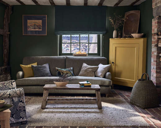
11. PICK A DEEP, EARTHY TONE
This snug living room, painted in Morris & Co’s Wooded Dell green, a new paint shade for 2022, creates a relaxed, inviting ambience. The deep green complements the traditional country cottage interior, with the yellow accent shade, Sunflower Yellow, adding an uplifting, contemporary twist.
12. PICK A DEEP CHOCOLATE BROWN FOR ENVELOPING WARMTH
Darker shades can feel a bit scary to use, but actually they can be a wonderful choice for a living room. Warm and nurturing, they work well in a room that feels too big, and of course, balance is key to making the rest of the scheme work.
Called Cherry Truffle and described as a ‘bitter chocolate with a hint of red’ hence the berry theme, the brown above looks great with lighter hues like ruby and claret as they’ll lift the overall look. If you add in a warm metallic – perhaps in accessories – the room will glow and not feel too dark. Keep the floor pale and the ceiling white for contrast.
Keeping your ceiling light will lighten the room and bring balance and contrast to the scheme; team the brown with warming shades like taupe, sandstone, blush and coral will create a cocooning feel that’s cosy and uber stylish – just make sure you have a few paler pieces, textures and patterns to add a decorative element.
13. GO BACK TO BLACK WITH YOUR LIVING ROOM PAINT IDEAS
A deceptive but delicious black paint, the blue undertones of this shade give a pleasurable richness and depth. When used with white, it will dramatically change the interplay of light and space in your room. Striking enough to take center stage yet subtle and confident enough to allow other hues to shine, black is a dream to work with.
Use it wall to wall in a room that gets lots of daylight, or highlight architectural features, such as window frames and shutters, in rooms that are more light-starved.
14. CREATE A SKY BLUE LIVING ROOM SCHEME
A shade that’s always been popular in the world of interiors, soft blue is a growing living room trend that is set to be next year’s color du jour.
Powder blue paint has the quality of being both soothing and invigorating, and offers plenty of design versatility. Used with crisp white and pebble grey, it creates a calming coastal feel, while as one block of color it can be an enveloping breath of fresh air.
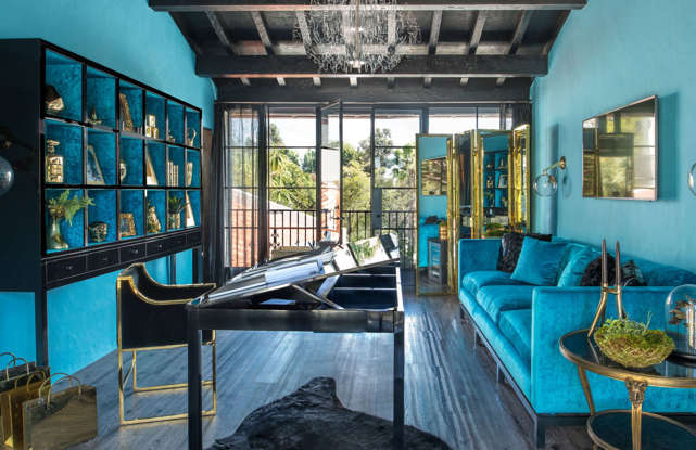
15. KEEP IT COOL WITH TIFFANY BLUE
If you love blue but are worried that the room you are decorating might feel a little cool afterwards, choose a color with a touch of yellow in it. This produces a much warmer blue that can cope with the coolest of atmospheres.
This cool color is inspired by the iconic packaging of the jewelery store. Tiffany blue is not a shade for the faint hearted, so if you’re nervous of adding bold color all over, use it in alcoves or on one feature wall, instead. The trick is to balance out this dynamic hue by teaming it with white furniture and distinctive color, such as red.
16. GIVE YOUR LIVING ROOM GREEN CREDENTIALS
Bringing the outdoors in by having green walls in your home is always a good idea; the nod to nature will create a calm atmosphere however busy the space, so integrating the color into a well-used living room works just as well as in a spa-style bathroom.
Green room ideas are also said to inspire creativity and spontaneity, making them ideal for your living room walls.
17. TURN UP THE HEAT WITH YELLOW
Sophisticated and inviting, yellow room ideas bring in warmth and a cocooning feel. Its rich, textured caramel tones elevate it from just another brown, making it surprisingly tranquil, particularly in small living rooms.
The earthy shade sets off the vibrancy in colors such peony pink, apple green and amethyst purple, but also highlights classic stone and white.
18. WARM A COOL ROOM WITH AN AUTUMNAL COLOR PALETTE
Lazy, far-flung holidays may not be a reality for many this year but you can still evoke the feeling of sun-drenched escapism with a burnt orange paint colour.
Walls painted in terracotta create a bold backdrop for building up layers of interest with a pale linen sofa, patterned rug and two-tone accessories.
19. PICK PALE PINK FOR WARMTH AND LIGHT
A strong trend and so versatile, pink is an easy color to pair with others and works particularly well when used with ochre, green, mulberry, coral or orange. At the stronger end of the palette, fuchsia or ruby are impactful, while the softer tones are ideal for a calming living room.
A room painted pink will look warm and inviting all day long, regardless of how much natural light is present, and at night the same space will be wonderfully cozy.
Try using a pink paint in a North-facing space to warm up that cool light. This beautiful scheme uses a calming color palette of pink and white with bright pops through the choice of accessories.
20. BE ENCHANTED BY WARM PINK
It’s inviting, uplifting and effortless to decorate with, so it’s no surprise that pink is now seen as an interiors neutral. But with choices from pastel to bubblegum, the right shade can prove a tricky quest.
There is an unexpected earthiness to a warm pink, recalling the natural landscape, that makes the color a dream companion to other shades. This versatile hue adds freshness when used alongside classic furniture, and impact in a more contemporary setting. Quite simply, it’s a pink for grown-ups.
21. PAINT A LIVING ROOM WITH A HERITAGE RED
When designing a living room, warm up the space with a heritage red. No other shade evokes a celebratory mood quite like a rich cranberry red.
Add a mix of eye-catching and natural elements, such as wooden furniture, bold pattern and accents of black, for a modern take on a traditional palette.
22. PAINT A LIVING ROOM RECESS
Paint is the perfect way to express your artistic and experimental side. ‘I see people being far more creative with paint these days, doing lovely things, such as painting the inside of a recess a darker shade to give it extra definition,’ says Joa Studholme, colour consultant, Farrow & Ball. ‘Ideas such as these can take as little as 20 minutes and will transform the room.’
The darker shade in the recess allows cherished objects to stand out, while the television successfully blends into the backdrop to create a subtly colorful yet minimalist living room.
23. CONTRAST LIVING ROOM PAINT IDEAS WITH WALLPAPER
Living room paint ideas are really useful for zoning an open- or broken-plan living room, particularly when used in tandem with wallpaper ideas.
The room above is a case in point – the cozier, darker area used for movie nights is in a color-blocked blue; this color is then picked up in the pretty – but much lighter – wallpaper in the part of the room used for socializing.
24. USE PAINT TO HIGHLIGHT LIVING ROOM FURNITURE
Living room paint ideas needn’t be limited to the walls – you can use color to quickly transform furniture.
Even just painting the inside of a display cabinet can introduce a beautiful accent color into your living room scheme, highlighting the beautiful objets you have inside.
25. MAKE ROOMS FEEL LARGER BY COLOR DRENCHING
Some believe that decorating with dark living room colors can make spaces feel smaller, however, when used across walls, woodwork and the ceiling they can in fact make a living space feel bigger – this technique is known as color drenching.
‘Painting skirting boards and window frames to match the wall color is a simple but stylish touch for the living room. Not only does this create a contemporary, monochromatic look, but it is also an easy way of creating the illusion of bigger walls, making the whole room appear more spacious,’ explains Justyna Korczynska, senior designer at Crown.
Elegant and sophisticated, color drenching a room in one dark shade can also help the space feel cosy and cocooning. A warm, velvety blue, this Indulgence paint from Crown pairs beautifully with the warmth and texture of a buttoned sofa in rich umber.
26. PAINT THE CEILING IN A CONTRASTING COLOR
If you have a room with high ceilings, why not take the opportunity to make a dramatic statement by painting the ceiling in a contrasting color to the walls?
Painting a ceiling in a lighter color to the walls can help lead your eye upwards to give the illusion of height, but is also a brilliant way to highlight architectural features such a beautiful plasterwork as demonstrated in this Georgian room.
In this space Paper & Paint Library’s Grenache on walls and Lady Char’s Lilac on the ceiling makes for a striking and playful pairing and is a fun way to channel the lilac trend.
‘If you want to incorporate lilac into a darker more dramatic interior, consider painting the skirting, wall and cornicing in the same color, with a lighter lilac color on the ceiling to create a feeling of height,’ explains Andy Greenall head of design, Paint & Paper Library.
27. ADD GRANDEUR WITH METALLIC FINISHES
When it comes to choosing living room paint ideas, it’s not just color that should be considered – the finish can make an impact, too.
‘I always love a high gloss lacquer finish in a living room, as it adds lightness and luxury to the space,’ explains New York-based interior designer Phillip Thomas. ‘I also enjoy experimenting with metallics, especially on ceiling ideas. A metallic finish on the ceiling can have a truly transformative effect, making your space feel much taller and grander.’
Phillip Thomas explains how color and finishes played am important role in the designs for his sister’s apartment (pictured). ‘There is nothing less than a satin finish on any surface. From having the walls skim-coated throughout, to using metallic finishes on the ceiling in the living room and library, it was about creating a kind of glow in the space,’ he says.
The designer also took care to consider the colors used in adjacent rooms to ensure balance throughout, choosing Benjamin Moore’s striking dahlia for this living room alongside its equally vibrant Aniline Red in the adjoining library.
28. LIFT SPIRITS WITH ORANGE
Being one of the most used rooms in the home it’s important that living rooms are happy spaces, and decorating with orange is guaranteed to bring a joyful, uplifting feel.
‘A firm Kelling favourite, orange is the new black and looks color with every colour you pair it with, says Emma Deterding, founder and creative director at Kelling Designs. ‘It brings in warmth, brightness and an uplifting energy whether you use it on a whole wall or bring in splashes of orange through your accessories.’
If you’re considering an all-orange scheme be sure to introduce plenty of texture and variations in tone to prevent the space feeling overpowering. For walls, use paint ideas that combine two tones of oranges and choose a rug with a gentle pattern as done in this scheme by Kelling Designs.
For upholstery, opt for sculptural shapes in deeper shades of orange to anchor the scheme and choose sumptuous fabrics such as soft velvet or chenille for added texture.
29. DON’T BE AFRAID TO BE BOLD
When it comes to choosing living room color ideas don’t be timid say the experts. ‘Stop playing it safe, and choose colors you love and bring you joy,’ advises the New York based interior designer Phillip Thomas. ‘In one of my favorite living rooms, we used Benjamin Moore’s Ladybug Red to create a super vibrant space with a strong personality.’
Warm and bold, the vibrant red shade helps balance the strong architectural lines of this space, but also makes a wonderful backdrop for patterned fabrics and bold artwork.
‘I also love layer artwork, whether that means creating a gallery wall of prints and photographs, putting a framed painting next to shelves of small sculptures, or creating a dialogue with architectural elements, such as hanging art over a bookshelf or propping it up against a column,’ adds Phillip Thomas.
Story by Jennifer Ebert